
There is too much text in your online course. And I can tell without even looking at it.
It’s the #1 problem I mention to designers, educators and corporate clients alike. Just too much blah, blah, blah.
Despite all your hard work, your course might really be sounding like this:
Burying your learners in text is killing your online course.
It only SEEMS like you have a captive audience but the truth is online learners are frustrated. If your course completion and achievement results are not what you had hoped … your learners are probably skimming their way through and/or feeling overwhemed by the content.
Time to get in touch with the zen of online course design.
Less. Clearer. Visual.
In this article, I’m going to share with you 5 different ways to get your courses leaner and make information management more successful for your learners.
Here we go …

1. Attack of the (Source Material) Clones

Most Moodle designers are educators and they tend to repurpose stuff they already have. It’s about survival. The vast majority of courses I have looked at (100+) are generally filled with the following:
- Pdfs, Word docs, Google Docs, and other text-based handouts
- Wikipedia and Research articles
- Digital versions of the textbook (“Read Chapter 7.”)
Instead of the course being visual, media-rich and personalized … it often looks like the flight manual for the space shuttle.
[Tweet “If your online course looks like a reproduction of a textbook, Houston, We Have a Problem.”]
Cognitive load theory explains why learners perform worse when faced with too much new learning. Textbooks can present an overwhelming amount of information, especially for learners who aren’t sure how to separate critical info from the not-so-critical. Learners still need to be guided through the material and have the important points made clear.
Here are a few quick and easy suggestions I hope can help make your material more engaging:
- Take screen shots of just the portions of a textbook you want learners to see. If they only need paragraph one and a pie chart, grab them ONLY. Capturing a screenshot is a quick way to create an instant jpg. Use [command+shift+4] for Macs and try Greenshot for PC’s. Then upload into your course.
- Create a screencast of you talking learners through the text. Act as a tourguide, walking them through a large chunk of reading.
- Find an infographic, whiteboard cartoon or youtube video that can replace the content you are asking them to read.
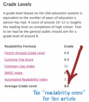
- Use a Reading Level tester to make sure you are adjusting any online content (like Wikipedia) to a “comfortable” reading level for your learner.
The main idea is to whittle down the volume of text, and try to avoid the “info dump” of large, unedited text blocks. And speaking of editing …
2. Kill Your Darlings
“Kill your darlings, kill your darlings, even when it breaks your egocentric little scribbler’s heart, kill your darlings.”
-Stephen King
This famous advice was given by many famous writers from William Faulkner to Stephen King. Being a course designer is also being a writer AND editor. This goes for copy/pasting from other sources too. It’s our job as course designers to be relentless when editing the words in our course, and learning how to write for the web.
Paragraphs can often be shorter. Or deleted completely.
Let go of everything that doesn’t make things clearer or isn’t directly tied to the curriculum.
Just that.


3. White Space is Your Friend
Less.
Not just of text. Less clutter.
Our eyes love white space. It’s relaxing. Just ask any interior designer when they are staging a home … their first piece of advice … “Get rid of the clutter!”.
I think the culprit may be the fear of making learners scroll down too long. If we space things out it makes the course too bulky. I agree if you are just spacing out your existing content you haven’t achieved the goal. Think of white space as a “step two” after seriously editing the content in the course.
Here some other quick ways to declutter your course:
- Get rid of tables that span the entire width of the page.
- Nested tables pack even more density (avoid)
- Experiment with larger headings, and dramatic spaces.
- Turn quotes and facts into graphics using Canva, Pinterest or Behappy
- Choose graphics that have white backgrounds

The idea is to present information inside a relaxed, easy-to-read page design.
4. The Time Trap
Are you measuring the completeness of your course by whether the outcomes have been covered … Or by how many hours the course (probably) takes?

Many courses are still being created with an older model of credit = hours. For example, a three credit course takes 75 hours to complete. The problem with online courses is … how do we measure time spent online?
Problem #1: Hidden time
Assigning a “length” of a course based on guessing how long a learner will take is haphazard at best.
Here are two big problems with this approach:
- Hyperlinked content is hidden and often not factored in to course hours
- Learning online requires extra technology skills (example: navigating through unfamiliar material or creating a student project) all of which are vastly underestimated in the time they take the learner.
The result? Many online courses have credit hours assigned to them that are more a rough estimate than actual fact.
Problem #2: Trying to act like an offline course
I hear some common insecurities from the educators I work with. Online work is “easier” or “not as challenging”. Students are “done early” or “learning less than in a regular classroom”. Despite numerous studies that distance learning has the same results as classroom-based learning, our fears and myths about online courses persist.
What happens when we design with this insecurity? We compensate by adding more text, readings and busy work.
Until we embrace the mindset that learning is independent of time, we will need to continue to educate our learners, parents and administrators about the differences they can expect in online learning.
Online learning is about engaging students with the curriculum, not filling time.
Here are some resources to point towards if there are some questions about online learning:
- The Quickstart Guide to Online Learning: Time, Project & Self Management Tips
- 7 Myths and Facts about Online Learning
- What is Competency-based Education
5. A Picture Speaks a 1000 Words
I’m a strong proponent of visual learning and using graphics of all kinds to engage learners. I have lots of tools to add images, audio and video to your courses on my Resources page.
While a picture DOES speak a 1000 words, which ones to choose and where to put them might need a bit of advice.
A few design rules and ideas:
- Pictures don’t replace editing. A picture is not magic. It alone cannot make a long text block suddenly more readable. Remember: Edit. Delete content. Break text into smaller chunks.
- Pictures ARE content. With thousands of images available to you, choose one that directly communicates something from the outcome you are addressing. Try not to think of it as window dressing to go along with the content. It IS content.
- Images and other visuals have a lifespan. That animated gif of the dancing smiley face may have been cute back in the 90’s … but it has to go. The Canva Design School is a fantastic place to get a sense of what modern graphic design looks like. Just wander around.
- Design around a theme. I always start my course designs by collecting 4-5 key images, a powerpoint template and a Moodle color set. This way the entire course draws on the same elements. It looks tied together. It also saves design time because you aren’t hunting around and breaking your workflow. Here is a video I made called “The Set Up”.
The Take Away
Reducing the text blocks in your courses can have a powerful effect on engagement and course completion.
Try using one or two of these suggestions in your course and see the difference it can make for your learners.
Let me know if you are trying to reduce the text in your course – and how that’s going – by leaving me a comment below.
Cognitive load theory explains why learners perform worse when faced with too much new learning. Textbooks can present an overwhelming amount of information, especially for learners who aren’t sure how to separate critical info from the not-so-critical. Learners still need to be guided through the material and have the important points made clear.
Here are a few quick and easy suggestions I hope can help make your material more engaging:
- Take screen shots of just the portions of a textbook you want learners to see. If they only need paragraph one and a pie chart, grab them ONLY. Capturing a screenshot is a quick way to create an instant jpg. Use [command+shift+4] for Macs and try Greenshot for PC’s. Then upload into your course.
- Create a screencast of you talking learners through the text. Act as a tourguide, walking them through a large chunk of reading.
- Find an infographic, whiteboard cartoon or youtube video that can replace the content you are asking them to read.
- Use a Reading Level tester to make sure you are adjusting any online content (like Wikipedia) to a “comfortable” reading level for your learner.
The main idea is to whittle down the volume of text, and try to avoid the “info dump” of large, unedited text blocks. And speaking of editing …
2. Kill Your Darlings
“Kill your darlings, kill your darlings, even when it breaks your egocentric little scribbler’s heart, kill your darlings.”
-Stephen King
This famous advice was given by many famous writers from William Faulkner to Stephen King. Being a course designer is also being a writer AND editor. This goes for copy/pasting from other sources too. It’s our job as course designers to be relentless when editing the words in our course, and learning how to write for the web.
Paragraphs can often be shorter. Or deleted completely.
Let go of everything that doesn’t make things clearer or isn’t directly tied to the curriculum.
Just that.

3. White Space is Your Friend
Less.
Not just of text. Less clutter.
Our eyes love white space. It’s relaxing. Just ask any interior designer when they are staging a home … their first piece of advice … “Get rid of the clutter!”.
I think the culprit may be the fear of making learners scroll down too long. If we space things out it makes the course too bulky. I agree if you are just spacing out your existing content you haven’t achieved the goal. Think of white space as a “step two” after seriously editing the content in the course.
Here some other quick ways to declutter your course:
- Get rid of tables that span the entire width of the page.
- Nested tables pack even more density (avoid)
- Experiment with larger headings, and dramatic spaces.
- Turn quotes and facts into graphics using Canva, Pinterest or Behappy
- Choose graphics that have white backgrounds
The idea is to present information inside a relaxed, easy-to-read page design.
4. The Time Trap
Are you measuring the completeness of your course by whether the outcomes have been covered … Or by how many hours the course (probably) takes?

Many courses are still being created with an older model of credit = hours. For example, a three credit course takes 75 hours to complete. The problem with online courses is … how do we measure time spent online?
Problem #1: Hidden time
Assigning a “length” of a course based on guessing how long a learner will take is haphazard at best.
Here are two big problems with this approach:
- Hyperlinked content is hidden and often not factored in to course hours
- Learning online requires extra technology skills (example: navigating through unfamiliar material or creating a student project) all of which are vastly underestimated in the time they take the learner.
The result? Many online courses have credit hours assigned to them that are more a rough estimate than actual fact.
Problem #2: Trying to act like an offline course
I hear some common insecurities from the educators I work with. Online work is “easier” or “not as challenging”. Students are “done early” or “learning less than in a regular classroom”. Despite numerous studies that distance learning has the same results as classroom-based learning, our fears and myths about online courses persist.
What happens when we design with this insecurity? We compensate by adding more text, readings and busy work.
Until we embrace the mindset that learning is independent of time, we will need to continue to educate our learners, parents and administrators about the differences they can expect in online learning.
Online learning is about engaging students with the curriculum, not filling time.
Here are some resources to point towards if there are some questions about online learning:
- The Quickstart Guide to Online Learning: Time, Project & Self Management Tips
- 7 Myths and Facts about Online Learning
- What is Competency-based Education
5. A Picture Speaks a 1000 Words
I’m a strong proponent of visual learning and using graphics of all kinds to engage learners. I have lots of tools to add images, audio and video to your courses on my Resources page.
While a picture DOES speak a 1000 words, which ones to choose and where to put them might need a bit of advice.
A few design rules and ideas:
- Pictures don’t replace editing. A picture is not magic. It alone cannot make a long text block suddenly more readable. Remember: Edit. Delete content. Break text into smaller chunks.
- Pictures ARE content. With thousands of images available to you, choose one that directly communicates something from the outcome you are addressing. Try not to think of it as window dressing to go along with the content. It IS content.
- Images and other visuals have a lifespan. That animated gif of the dancing smiley face may have been cute back in the 90’s … but it has to go. The Canva Design School is a fantastic place to get a sense of what modern graphic design looks like. Just wander around.
- Design around a theme. I always start my course designs by collecting 4-5 key images, a powerpoint template and a Moodle color set. This way the entire course draws on the same elements. It looks tied together. It also saves design time because you aren’t hunting around and breaking your workflow. Here is a video I made called “The Set Up”.
The Take Away
Reducing the text blocks in your courses can have a powerful effect on engagement and course completion.
Try using one or two of these suggestions in your course and see the difference it can make for your learners.
Let me know if you are trying to reduce the text in your course – and how that’s going – by leaving me a comment below.
Leave A Comment